
Your Custom Text Here
Molamil - refreshing portfolio
It's often hard to come across new ways of presenting your projects and portfolio online. It's even harder to present them in a unifying aesthetic. Especially in the digital world, showing your work on phones and screens (to which I am guilty of) get repetitive. I think Huge do this really well on the website, using their H as a window.
Another site that I've just come across is Molamil. Their repeated graphical patterns using elements from the projects, set against a punchy coloured background is refreshing and beautiful.


On another note, their menu/stamp gives their own personal touch to the standard hamburger menu.
Three simple dots
The below animation video from Asana is really a stand-out in execution, showing just how expressive three little dots can be. Oh! How ever so lightly they bounce and glide! And the perfectly timed chimes!
GIFs as transitions
I'm currently at a point in my career where I am really excited by digital design, by its fast-moving nature and its many unknown possibilities. Nine years ago when I first started university, apps weren't even around. As such, my tertiary education had a very strong print focus.
The bridge between print and digital design is where I like to sit because I do genuinely love designing for both. Although the design basics are the same across both, there are different things you have to take into account in digital design. One of those things is transitions between screens and between elements, which aid in learning interactivity as well as adding to a sense of delight to the user experience.
The reason I bring this up is because Marvel have recently posted a blog that I really liked about using gifs like this and this in prototype animations. A lot of the prototyping tools out there such as Marvel and Invision allow for basic transitions between screens but not within. I was also recently asked to use Flash to help developers understand the kind of animations I wanted on an interface. Except I've never needed to used Flash throughout my career so far. So I think gifs are a simple an accessible way (for designers) to be able to communicate these ideas earlier on in the process.
Adidas tracksuit

I recently saw this sign stapled to a telegraph pole and it made me wonder what kind of person would call up and buy Adidas tracksuits. It's endearing but a bit suss and reminded me of this.
Get On Up poster
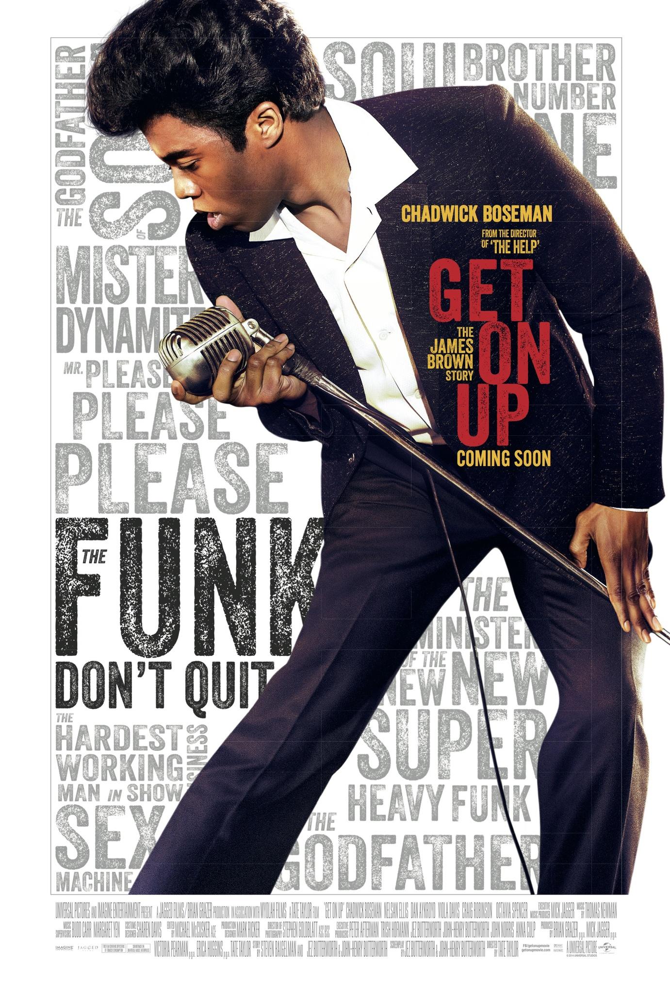
I've use the London tube almost everyday for nearly 2 years and consequently pass a lot of movie posters and adverts. This one for Get On Up particularly caught my eye. There's a certain energy about it that I really like – the way the slant of the leg cuts through the page, and the way that Chadwick Boseman is cropped, the poster not large enough to contain him. Then there's the type – textured, condensed, layered. It reminds me of Paula Scher's famous posters for the Public Theatre. It all comes together that nicely represents the king of funk and soul.
Green man festival


I was recently at Green Man festival in Wales and was impressed by its logo and branding but haven't been able to find out who did it. (Any enlightenment on this would be welcome). The textured illustrations and earthy colours positioned it as a more low-key festival and in contrast to the glossier high-octane look of V festival that was also on that same weekend. I particularly like the 10 icons that add visual dimension to the brand and give it a modern/primitive look.
What is also always of interest to me is the bilingualism and the challenges it presents typographically. Green Man presenting the name of the event in English and Welsh (although this was the only time I saw any of the material in Welsh) and it's lucky that the Welsh name has a similar amount of letters as in English. It's a nice nod to the festival's heritage but would have like to see that extended a bit more.